On Book Covers and Prussian Blue
You might wonder how I got my book cover idea. It is a perfect blend of Prussian Blue, Titian Venice-inspired light, the Trinity, and the book cover of my dad’s 1980’s book, Culture in Christian Perspective, served up under the capable book design of Mark Eddy Smith.

Mark is a friend of ours from old writers’ group days in the 1990’s in Wheaton, IL. A humorous and kind friend and writer, he got his start typesetting in “The Job,” a “graphic design” job that multiple men in our group held doing design for La Leche League. This was irony in that we were none of us part of the child-bearing years at that point in time, but it definitely opened my eyes to the glories of motherhood, more on which later. Mark is also a talented book cover designer, and he took my requests and specificity…

Bible as Literature Workbook Cover
…and came up with a book design I love. It reminds me of my dad’s Culture in Christian Perspective cover, a good nod to the collaboration of this book, The Bible as Literature Workbook, that came of the gift of all his teaching notes and my head for homeschool and Christian school curriculum design.
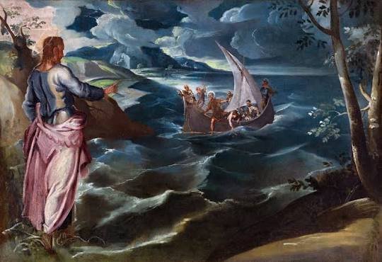
Christ on the Sea of Galilee, Tintoretto
The Tintoretto painting Christ on the Sea of Galilee has long been a favorite of mine for its beautiful Prussian blue waves and Venetian warm golden light, famous in all the Venetian masters’ paintings. I love the stillness emanating from Christ’s upraised hand, and Peter, little Peter, climbing out of the boat to come to Jesus. You can see Christ’s command of the situation, His arced back mirrored in the arc of the sail, and the still quality of the tree of life beside him on the bank. This painting speaks to me of Christ’s reign in my chaotic life and my captivated heart’s rest in Him. I also feel it captures many symbolic arcs of the Bible, from the Tree of Eden to the Tree of Revelation, the leaves of which are for the healing of the nations, and thus was a good image for this workbook on symbol, narrative, and poetry in the Bible.

The Logo
For the logo, Mark generously put up with my back-and-forth as we hammered out how the upraised praising and praying hands would come out of the Bible, symbolizing the “take and read” part of this publishing imprint as well as the wings of the Holy Spirit dove and the flame of Pentecost; pointing both to the Trinity and to our need to pick up and read, as Augustine heard one summer’s day in the garden: “Take and read, take and read!”
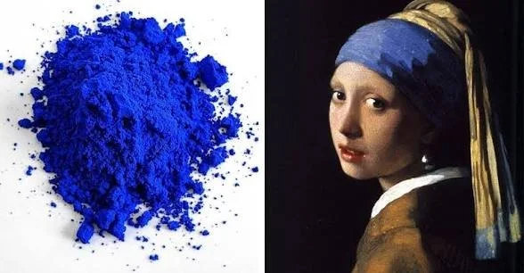
Prussian Blue
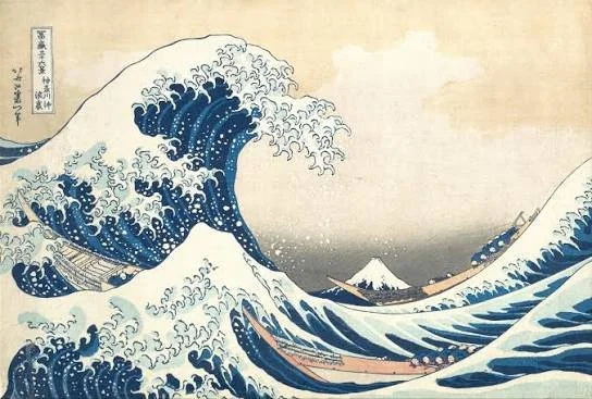
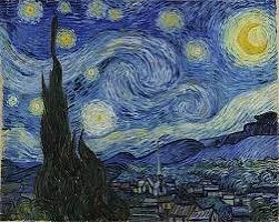
Prussian blue, the color of the logo and the cover art, is my favorite paint color. It was discovered in 1704 by Berlin dye-maker Johann Jacob Diesbach. Diesbach shared a lab with an alchemist, and mixing his red cochineal beetles with bits of iron left over from blood in the petri dish led to the discovery of a cheap new way to make vivid blue ink. Easier than grinding lapis lazuli, it allowed for cheap blue ink and paint. This color in turn influenced the work of Hokusai and other Japanese printmakers…
Starry Night
…and had a lasting effect on European impressionist painters, in particular on the wavy sky of Vincent Van Gogh’s Starry Night painting.
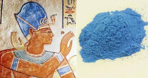
Egyptian Blue
While the alchemist’s dubious experiments led to chemical weapons in WWI, the ink color has been beautiful and life-giving. Blue paint-making technique from the Egyptians was lost after the Roman collapse during the Middle Ages…
Lapis Lazuli…
…and the grinding of Lapis Lazuli was laborious and expensive. This democratization of the color blue from the blood of animals and the cochineal beetle allowed for its wider dissemination.
This democratization fits the vibe of Take and Read Books, whose aim is to put literary study from a Christian perspective in the hands of middle and high school students who can learn for themselves how to study literature from a Christian point of view, simultaneously reveling in the shed blood of a risen Savior, Christ the Lord, efficacious for our sins and sorrows. Christ is Risen, Alleluia. Take and Read!